Building College Football Scorigami: From Twitter Inspiration to Interactive Data Visualization
-
 Dustin Riley
 - 02 Aug, 2025
Building College Football Scorigami: From Twitter Inspiration to Interactive Data Visualization
As a software engineer with a passion for college football, I’ve always been fascinated by the intersection of sports and data. But it wasn’t until I stumbled upon a Twitter thread between FBS Communications Directors that I found my next side project.
The Spark of Inspiration
It started with a simple tweet thread. One Communications Director had shared a beautifully crafted scorigami chart for their football program, showcasing all the unique score combinations their team had achieved throughout history. The response was immediate and enthusiastic—another Communications Director replied that they were going to create one for their own program.
That’s when it hit me: What if there was a website where any fan could explore scorigami data for their favorite team, conference, or even compare across different eras of college football?
For those unfamiliar with the concept, “scorigami” was popularized by Jon Bois in his excellent video series, referring to final scores that have never occurred before in a sport’s history. It’s a delightfully nerdy way to look at sports statistics.
Technical Architecture: Building for Scale and Performance
The Tech Stack
I chose Next.js 15 for learning. I hadn’t used it before and this felt like it met the usecase. The full stack includes:
- Frontend: React 19 with TypeScript for type safety
- Styling: Tailwind CSS v4 with shadcn/ui components
- Visualization: Custom CSS Grid heatmap (more on this decision below)
- Database: PostgreSQL hosted on Neon
- Hosting: Vercel for seamless deployment and analytics
- Data Source: College Football Data API (CFBD) with local caching
Interesting Technical Decisions
From API to Database: Solving the Timeout Problem
The first iteration of the site relied entirely on the CollegeFootballData.com API. While their service is fantastic and free for developers, I quickly ran into timeout issues when users requested large datasets—like “show me all SEC games from 2000-2023.” API calls would fail after 30 seconds, leaving users frustrated.
The solution was migrating to a PostgreSQL database hosted on Neon. Now I batch-load data from the CFBD API during off-peak hours and serve it directly from the database. This not only solved the timeout issue but also enabled more complex filtering and aggregations that would be expensive to compute on-demand.
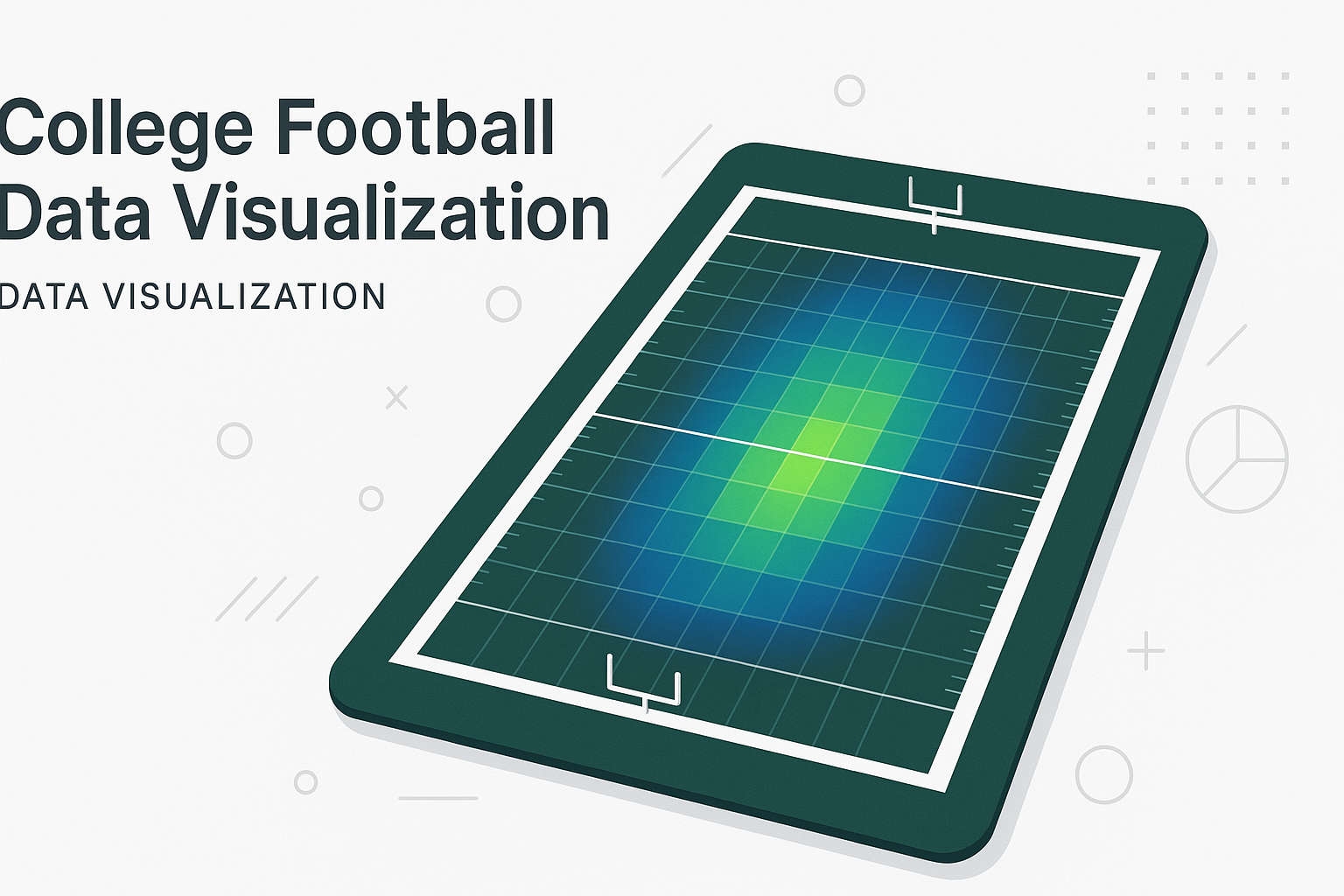
CSS Grid Over Chart Libraries
Initially, I used ApexCharts for the heatmap visualization. While functional, it felt overkill for what’s essentially a colored grid. I migrated to a pure CSS Grid implementation with Tailwind classes, resulting in:
- 60% smaller bundle size
- Faster rendering for large datasets
- Better mobile responsiveness
- Easier customization of hover states and interactions
// Simplified version of the grid cell component
const HeatmapCell = ({ score, frequency, maxFrequency }) => {
  const opacity = frequency / maxFrequency;
  return (
    <div
      className="aspect-square border border-gray-200 hover:border-gray-400"
      style={{ backgroundColor: `rgba(37, 99, 235, ${opacity})` }}
    >
      {frequency > 0 && <span>{frequency}</span>}
    </div>
  );
};
Repository Pattern for Data Sources
To handle potential future data sources (and the current API/database hybrid), I implemented a repository pattern:
interface DataSource {
  getGames(filters: GameFilters): Promise<Game[]>;
  getTeams(): Promise<Team[]>;
  isHealthy(): Promise<boolean>;
}

class GameDataRepository {
  constructor(private sources: DataSource[]) {}

  async getGames(filters: GameFilters): Promise<Game[]> {
    for (const source of this.sources) {
      try {
        if (await source.isHealthy()) {
          return await source.getGames(filters);
        }
      } catch (error) {
        console.warn(`Source failed, trying next: ${error.message}`);
      }
    }
    throw new Error('All data sources unavailable');
  }
}
This architecture automatically falls back between data sources and makes it trivial to add new ones in the future.
Performance and User Experience
The site handles datasets with 100,000+ games while maintaining sub-second load times through:
- Smart caching: Repository-level caching with TTL for expensive queries
- Optimistic filtering: Client-side filtering for immediate feedback on filter changes
- Progressive enhancement: The core visualization works without JavaScript
What’s Next: Future Enhancements
URL-Based Filter Sharing
The most requested feature is the ability to share specific filtered views. Imagine being able to send someone a link directly to “Alabama vs Auburn games from 2010-2020” or “All Big Ten blowouts (>21 point margin).”
Implementation will involve:
- Syncing filter state with URL query parameters
- Deep linking to specific visualizations
- Maintaining backward compatibility with existing bookmarks
Export and Social Sharing
Users want to save and share their discoveries. Planned features include:
- PNG/SVG export of current heatmap view
- CSV export of filtered game data
- One-click social media sharing with dynamic preview images
- PDF report generation for coaching staff and media
Enhanced Filtering
The current filter system is just the beginning. Future additions could include:
- Venue type (home/away/neutral site)
- Game significance (rivalry games, bowl games, playoffs)
- Weather conditions (if available in the data)
- Conference matchups vs. non-conference games
Open Source and Community
The entire project is built with modern web standards and best practices. While the codebase isn’t open source yet, I’m considering it—especially the data visualization components and repository pattern implementation, which could benefit other sports analytics projects.
Wrapping Up
What started as inspiration from a Twitter thread has become a tool used by college football fans, sports media, and even some of those original Communications Directors who sparked the idea. It’s a reminder that the best side projects often come from solving problems you personally want solved.
The intersection of sports and technology continues to evolve, and tools like this represent just the beginning. When you can combine passionate communities (college football fans) with rich datasets and modern web technologies, magic happens.
Visit College Football Scorigami to explore the data yourself, and let me know what unique score combinations you discover!
Want to discuss the technical implementation or have ideas for new features? Find me on Twitter @dustin_riley or check out the site at scorigami.dustinriley.com.